TYPO BERLIN
Brand Identity System
RECOGNITION
Graphis New Talent 2022, Silver
Communication Arts 2022, Shortlist
Creative Quarterly, Graphic Design Winner
Creative Quarterly 100 Best 2021 Annual
TOOLS
Illustrator, InDesign
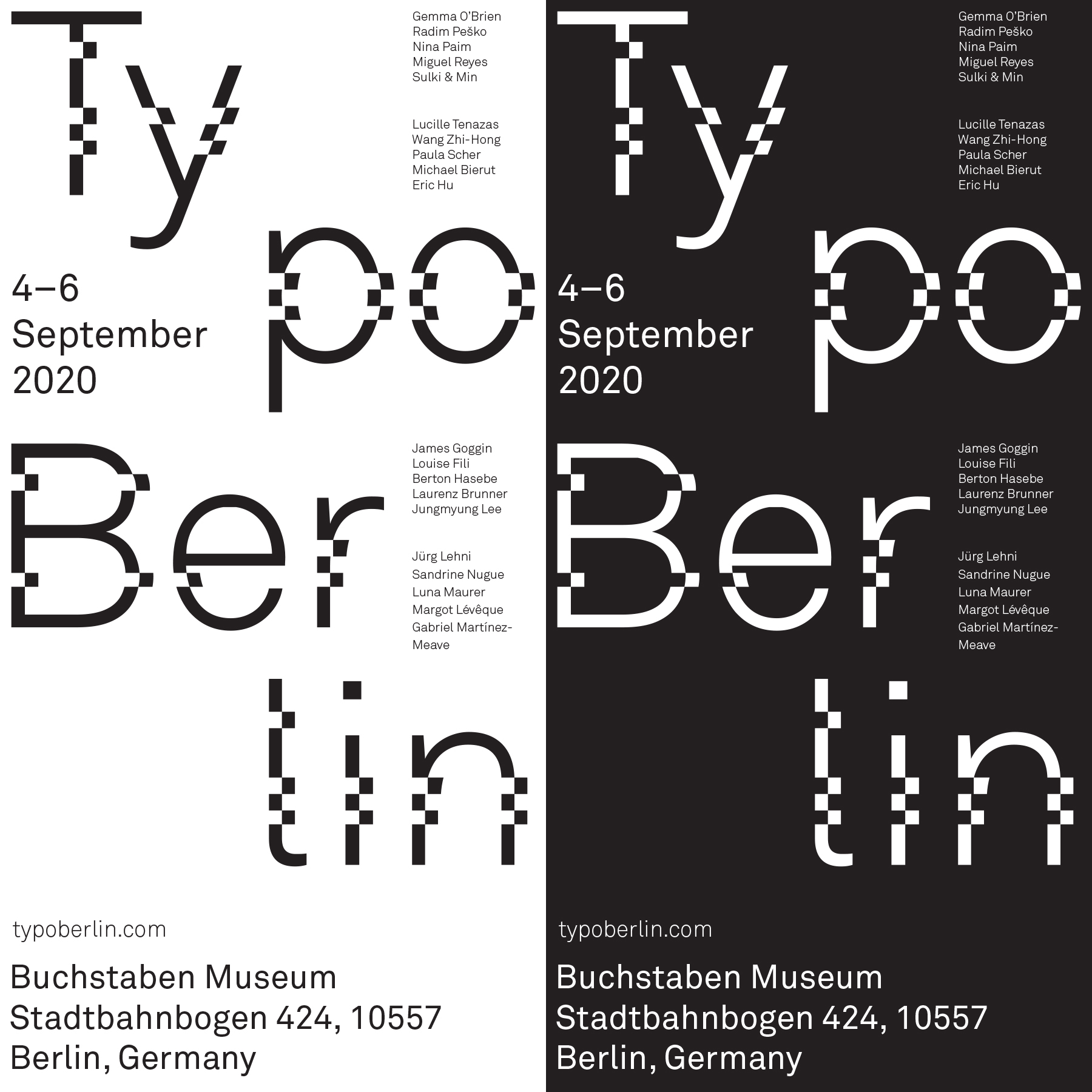
This brand identity system is for a fictional type conference called TYPO Berlin. This identity is intended to reflect the modern evolution of typographic design.
Akkurat is utilized as the typeface for the word "mark.” The clean and neo-modernist aesthetic of the typeface communicates the modernity of the conference. In order to express how typography design evolves over time, I deconstructed the word “mark” and broke up the words into syllables. This also creates a sense of movement that guides the viewer’s eyes throughout the composition.
Banner


Name Badge

Tote Bag


